Unlocking Brand Potential With Atlanta's Newest Top Digital Agency
On Being Spicy What happened to advertising? It seems that in the last decade, the advertising industry as a whole unanimously decided to become the...
13 min read
Matt Whitfield
:
Aug 28, 2023 6:42:48 AM

UX (User Experience) design is undoubtedly one of the most indispensable aspects of website optimization, and yes, we are prepared to die on this hill.
When done right, UX design can have a direct impact on how visitors experience your website and how likely they are to make a purchase. But UX design isn't just about how your webpage looks. It's about how it feels. It is like a combination of design best practices, conversion strategies, and behavior analysis all rolled into one. From navigation to search experience to content organization, it's all user experience.
Well, if you want to get technical about it, UX design is the process of improving user satisfaction by increasing accessibility, responsiveness, and the quality of their interaction with websites. It crafts an experience that's seamless and enjoyable for your users, right from the get-go.
Behind every great User Experience is an even better User Experience designer. But who are these digital heroes coding behind the curtain? These are people who make it their job to focus on understanding the user and why they behave the way they do. It's their responsibility to make sure the user’s needs are being met. A UX designer also needs to be able to spot issues with a website before it goes out into the world.
Sometimes, a business will bring in a UX designer to give their website an audit. Not like a tax audit. The IRS isn't busting down anyone’s doors. This audit is all about conducting UX research. More specifically, it's about collecting data and facts to assess the user experience of a website or app. User research is important because it helps UX designers understand how people use their website or app. With this new important information, they can then make informed design decisions that will improve the user experience.
UI (User Interface design) and UX design are related concepts that are often used interchangeably, but they refer to different aspects of digital design. And both UX and UI designers desperately want you to understand the difference.
UI refers to the visual and interactive elements of a digital product, such as buttons, menus, icons, and typography. UI design focuses on creating an attractive, user-friendly interface that allows users to interact with the product in a clear and intuitive way.
But here's the kicker — UI isn't just about making things pretty. Au contraire, mon frère. It's about creating an interface that's intuitive and engaging, one that practically begs for interaction. Oh, please click through me, website visitor. I need interaction.
*Ahem*
UX, on the other hand, encompasses the entire user journey, including how users feel about using the product. UX design focuses on the user flow and how to create a positive experience for the user. UX ensures that the webpage is useful, easy to use, and enjoyable to interact with.
In other words, UI is concerned with how a user feels when they look at it, while UX is concerned with how a user feels when they interact with it. Both UI and UX are important aspects of good design and are essential for creating successful digital products.
UX design is the behind-the-scenes work that comes together to create a captivating, clickable experience for your website visitors. It makes sure that your website stands out from the crowd with original layouts, responsive menus, and eye-catching colors. So, if you're looking to improve your website's user experience and conversion rate, we've got some tips for you.
Let's talk about landing page conversion rates for a second. What is considered a 'good' conversion rate? Well, the top 25% landing pages in the world have an average conversion rate of a little over 5%. The top 10% of landing pages have a conversion rate of around 11%.
But how do we get there? To get those numbers, you need to double down on elements like color, design, copy, and animation. We’re not just trying to make your webpage engaging; we’re trying to make it downright seductive. And there’s no better place to start than with the sexiest design element of them all - the Call-To-Action (CTA)!
A few years ago, we knew this creative director who outright refused to approve any creative if the CTA button used generic messaging. He was a stickler! But he wasn’t wrong. He knew that if you wanted your CTA to get clicks, it's better to have buttons that label what they do clearly. He always defended this point by explaining that people don’t click on buttons if they aren’t confident in what they do. So be specific, not generic.
You can make your Call-to-Action (CTA) button more prominent by using colors that stand out. Think of your website visitors as female peacocks who go absolutely crazy for a brilliant, contrasting display of color. But which colors, you ask? Well, think about your brand colors and apply the 70% / 20% / 10% rule.
The 70% / 20% / 10% rule is an unwritten design guideline that says 70% of your color should be your dominant brand color, 20% should be your secondary color, and the last 10% should be an accent color that you use sparingly to create visual interest. Whatever that 10% accent color is, that’s the color you’re going to want to use for your CTA to give it that bright, bold contrast.
But here's the deal, once you’ve settled on that accent color, stick to it! Choosing a single color for all your CTA buttons can simplify your design and keep things consistent across your website. It’s all about design consistency. For example, if all the CTAs are pink, then the user knows Pink = Click.
Large font sizes and bold letters help make your CTA the focal point of your page. You’ll also want to make sure that CTA button is visible above the fold. 'Above the fold' refers to the portion of a website or digital document that is visible to a user without having to scroll down or navigate further. If your users can’t see the CTA, then they can’t click it.
Here’s another trick of the trade: animation. There are so many simple ways to make that CTA button pop, and motion is one of the most powerful ways to capture our monkey brain’s attention. But it needs to be used sparingly.
Animations can catch the user's attention and draw it towards the CTA. This can make it more likely that the user will engage with it. But animations can also be distracting if they are too flashy or intense and may draw attention away from other important information on the page. When done well, animations can make it easier for users to understand how the CTA works and what they can expect to happen when they engage with it. Done poorly, animations may confuse users and make it harder for them to understand how to interact with the CTA.
If you want to boost your conversion rate, the key is to make your content easy to read and access. UX designers can do this by optimizing for mobile, playing with different types of headings, and incorporating white space.
It's no secret that mobile is taking over the world. If you want your website to stay relevant, you need to think mobile design first. Desktop should be prioritized second. Mobile usage surpassed desktop usage back in 2015. And today, mobile device traffic makes up over 60% of all online traffic.
If your mobile users can't figure out how to navigate your site, they'll bounce faster than you can say 'conversion rate'. That's why you need to not only optimize your site for mobile but also pay attention to all the little details like your homepage, search, navigation, categories, and checkout pages. Trust us, it's not just worth the effort — it's absolutely necessary.
If you want your website to be easy to navigate, it’s a good idea to give your copy a bit of hierarchy. For example…
Headlines are great for grabbing attention!
Subheads are great for introducing Body Copy.
Body Copy includes all the fun details that you want to say. They’re usually a sentence or two in length, and they almost always end in a CTA. Keep reading for more!
— Bullet Points —
Headlines, subheads, body copy, and bullet points organize your copy so users know what they should be reading first, second, third, and so on. This makes the important stuff stand out and helps visitors navigate your site more quickly. Just be sure to use the right font sizes, colors, and styles to keep things looking sleek and professional.
White space is a UX designer's secret weapon. It gives your content some breathing room so it doesn't look like a hot mess. By using white space, you can make your content clearer, more readable, and easier on the eyes. Plus, it helps you create a sense of hierarchy and balance between all the different elements on your page. Any UX designer you meet will advocate hard for this.
Don't want to overload your visitors with too many graphics or logos? No problem — add some white space. Worried that your website looks too cluttered and doesn't have enough visual breaks? Easy solve — add some white space.
The best part? It's super easy to do! Just add some margin and padding around your content, and you're good to go. Like so:
Boom! Now you've got web pages that are not only visually stunning but also easy to read and understand. Your audience will thank you for it.
If your website has a 404 error (or any type of error), it's a nightmare for your user. It's the worst! Not only is it super frustrating, but it can also ruin their entire browsing experience and even decrease the likelihood of them sticking around and converting.
But there's hope! You can help keep your users happy and engaged, ultimately leading to higher conversion rates, and all you have to do is follow these couple of tips.
An Error State is a screen that pops up when something didn't go as planned. They're not exactly what the user is hoping to see when they click on a link, but hey, sh*t happens. In UX design, there are a few best practices that can be followed to ensure a good user experience when Error States inevitably occur.
— Provide clear and concise error messages: Error messages should be easy to understand and provide clear guidance on how to resolve the error. Use plain language and avoid technical jargon.
— Highlight the location of the error: If an error occurs due to user input, highlight the location of the error, so the user knows where to focus their attention.
— Offer solutions and options: Provide helpful suggestions for how to fix the error or offer alternative options for the user to continue with their task.
— Use color and visual cues: Color and visual cues can be used to draw attention to the error and make it easier to spot. Use red or yellow to signify an error or warning.
— Test Error States thoroughly: Test the system thoroughly to identify potential Error States and ensure that they are handled appropriately. Make sure that error messages are displayed consistently throughout the system.
— Provide feedback on progress: If the system is taking some time to process a request, provide feedback to the user on the progress. This can help to reduce frustration and anxiety when waiting for the system to respond.
When it comes to error states, the goal of UX design is to make the user aware of the error and help them resolve it quickly and easily, without causing undue frustration or confusion. Error states are about being clear about what the issue was, helping them rectify if possible, and providing them another path if they can't.
It's always a bummer when you click on a link and end up on a 404 page, right? But you can make this experience a little less frustrating by creating customized error pages with navigational elements that can redirect back to your homepage or another page on your site. Adding a search field is a great example of one such navigational element. So if your users hit a dead end, they can get back to where they want to be in no time. That way, when your visitors stumble upon a broken link, they won't get frustrated and leave. Instead, they'll have other options to explore and stick around.
Designers can even take it a step further and make error messages more fun and friendly. By putting a little personality into your error pages, you can help reduce user annoyance and make the experience a bit more enjoyable for everyone.
So far, we’ve talked about UX design, but we’ve got more tips for web developers to help make the user experience better for everyone.
If you want search engines like Google to start prioritizing your webpage, then it’s time for you to start prioritizing your loading speed. Great UX is fast UX. It’s 2023. No one waits for a page to load anymore. Creating a fast and responsive design for your website is so incredibly, extremely, undeniably important.
One way to make your website move like The Flash is — ironically — getting rid of Flash content. Your website will move faster if you use HTML5 content instead. Removing these non-essential features helps it load more quickly.
Another tip to consider is A/B testing. This method involves testing different versions of your website content on different groups of website users to determine which version produces the highest conversion rate. By doing so, you can identify which elements of your website are most effective at driving conversions and focus your optimization efforts on those elements.
Large image files can slow down your website's load time. Optimizing images involves reducing their file size without compromising on quality.
Optimize by following these steps:
If you want to cut down on your loading time, start by axing any unnecessary features or functions. For example, when designing or redesigning a website, it's unnecessary to include all the Java and CSS goodies that you might find in the code of a smartphone app.
Another way to speed up your site is by reusing components and micro-interactions from user-friendly mobile apps in your website design. This can help keep your JavaScript and CSS files smaller, which means faster load times for your pages.
Another trick to maximizing loading speed is to cut down on the number of HTTP requests. HTTP requests are messages sent by your browser to a server to fetch specific resources. HTTP is the protocol used for communication between web clients (like your browser) and servers, so by reducing the number of requests you make, you can save precious load time.
You might consider using a content delivery network (CDN) to host certain page elements. This can really help speed things up by reducing loading times. Another tip is to minimize redirects, which can add extra requests and slow things down even more.
You can also reduce page loading time by caching the required resources for a web page. When your users visit your page, their browser has to download all the resources needed to display it. When those resources get updated, their browser has to re-download them, which can make their page take even longer to load. Pretty annoying, right?
By storing those necessary resources on their computer, the next time your users visit your page, their screens will load faster since they don’t need to download everything all over again. But does that mean they’ll have all this information downloaded on their computer forever? Of course not! By setting an expiration date, marketers can let their user’s browser know when it should replace those cached resources with updated ones. Genius!
If you want to take your website to the next level, you need to give UX the love and attention it deserves. But don't think you can just slap together a few wireframes and call it a day. Oh no. You need to understand your users and why they operate the way they do. You need to know their every move and desire if you want to design the perfect experience.
And if you want to learn more about how we can take your website from zero to hero, get in touch with our team of experts for a free consultation. Trust us, your users will thank you.
Having poor UX design can hurt your website and brand. If users can't find what they're looking for or can't figure out how to do what they want, they'll start forming a negative opinion of you and your brand. This can lead to lost sales opportunities as visitors may leave instead of trying to figure out your webpage.
And it doesn't stop there. Poor UX will inevitably lead to error messages, which make the web experience even worse. To make matters worse, people may not want to return to a website that they already know doesn't function well, meaning you could potentially miss out on future sales conversions. Internally, a poor design can also affect your employees, causing frustration and decreasing their morale and productivity. So, it's essential to invest in good UX design to avoid all these negative consequences.
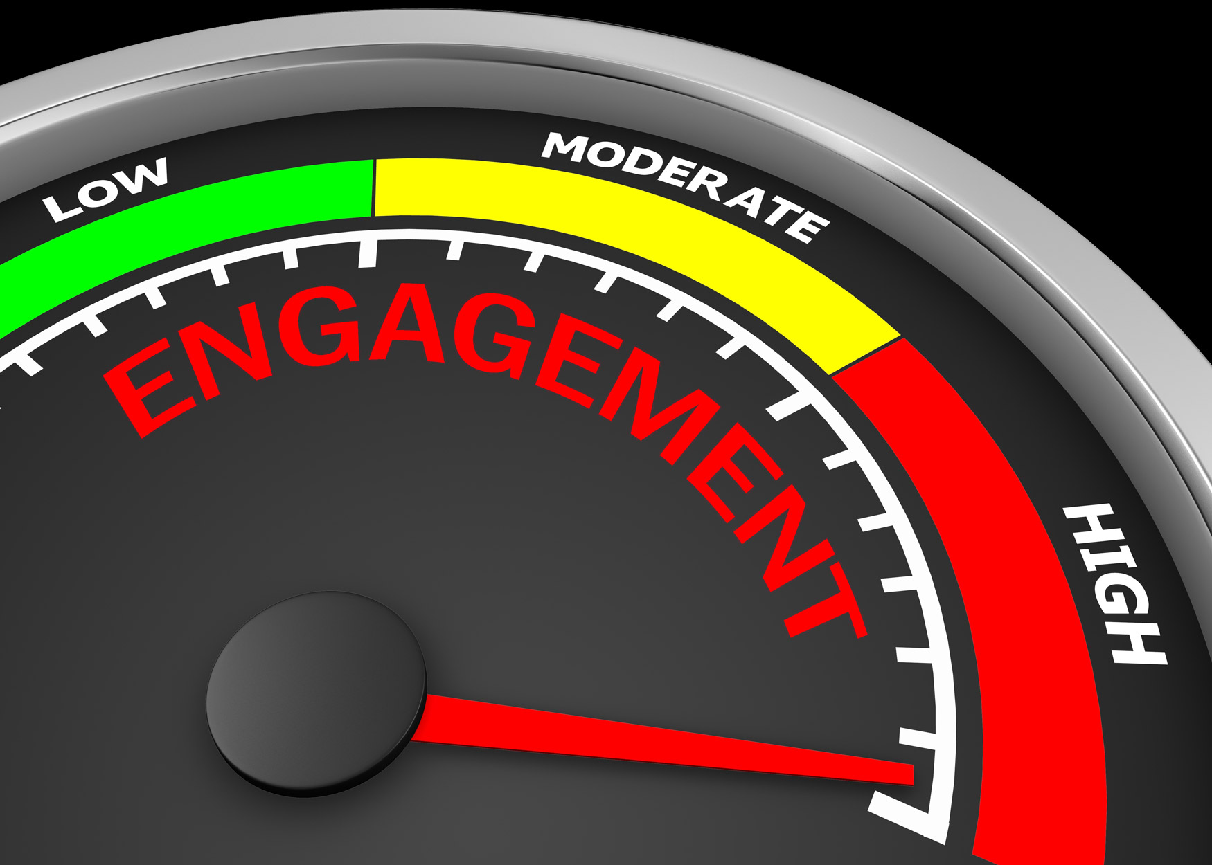
A good UX will naturally lead to an increase in conversions. The two go hand-in-hand. In order to improve conversions, your website should be easy to navigate, load quickly, and have all your content nicely organized so that users can find what they need without any hassle.
Another important factor to consider is your call-to-actions (CTAs). Make sure they're visible and easy to find, with clear instructions on what the user needs to do to complete a conversion.
To get a comprehensive view of your website's performance and user experience, you can track metrics like conversion rate, time on page, and bounce rate. Keep in mind that other factors such as the product being sold and the target audience can also impact conversion rates.
Your focus should be on making sure that your website is easy to navigate, and that visitors can quickly find what they're looking for. If your landing page is busy and convoluted, it’s time for a redesign. You don't want your visitors to get frustrated and leave because they can't figure out how to get around your site.
One tip is to use white space to separate different elements and make your page less cluttered. When used correctly, white space can help draw attention to important parts of the page, such as calls-to-action that encourage visitors to take action.
Finally, you should run conversion rate optimization tests. This involves testing different layouts and designs on your website to see which ones are most effective at getting visitors to convert. By experimenting with different approaches, you can learn what works best for your audience and improve your conversion rate over time.
Website Conversion Optimization is the art (yes, this is an art) of designing a website that motivates visitors to take action, such as filling out forms, generating leads, and increasing sales. To do this, first you need to understand user behavior. What do your users want? How are they likely to interact with your website. You want to make it as easy as possible for people to find what they're looking for and take action quickly.
There are various ways to increase conversions, such as adding clear call-to-actions, creating dedicated landing pages, and showcasing testimonials. You can also use design principles like negative space, human models, and fast loading speeds to create a more user-friendly website.
By focusing on these elements and keeping up with web design trends and best practices, you can effectively improve your website's conversion rate optimization.
To understand how effective your website is at turning visitors into customers, it's crucial to measure the success of your conversion optimization efforts. Here are some tips to help you get started:
First, it's important to calculate your website's conversion rate. To do this, simply divide the total number of leads or sales generated by the total number of website visitors. This will give you an idea of how well your website is performing in terms of helping visitors convert.
Next, take a look at your website traffic statistics to better understand user behavior and preferences. Factors like bounce rate, page views, time spent on site, and average pages viewed can help you identify areas for improvement that may lead to better conversion rates.
Another way to gain insights into user experience is by conducting user surveys. This can help you understand what visitors find confusing or frustrating, as well as how they rate their overall experience on your site.
Finally, try A/B testing to validate any changes you make to your website's design, layout, messaging, and user experience strategy. This will help you ensure that any changes you make are actually improving your conversion rate optimization efforts over time.
On Being Spicy What happened to advertising? It seems that in the last decade, the advertising industry as a whole unanimously decided to become the...
Social media marketing is cutthroat, and brands need to fight for attention. But with the right understanding and analytics, you can stand out. One...

Search Engine Optimization (SEO) is the bread and butter of any SaaS company's growth strategy. It's a vital part of any marketing plan for...